Production designer Peter Francis and director Florian Zeller tell Screen why a subtle touch was crucial for crafting nuanced dementia drama The Father.
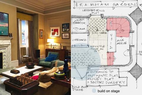
In Florian Zeller’s award-winning stageplay The Father, the bewilderment of its elderly male protagonist is conveyed through an ever-changing set design for his living space, which becomes increasingly dramatic in impact as the story unfolds — climaxing with a totally empty stage.
“Onstage, the apartment was step by step disappearing, pieces of furniture were disappearing, in order to go to the emptiness of the stage,” explains Zeller, the France-born writer/director of both the stage and film versions of the dementia drama, in which the main character’s failing memory turns family members into strangers, and makes time stutter and jump. “Of course, [an empty set] is something that could not be done on screen, because there is no abstraction in cinema.
“So we had to find another way to play with the feeling of disorientation of the audience, as if they were going through a labyrinth, and trying to understand what is going on. From the very beginning, we said the film should be like a puzzle, and that the audience could play with all the pieces of the puzzle to make it work. We needed to find the delicate balance in the set design, to be precise enough but not too explicative, just to create the feeling that you don’t know exactly where you are.”
UK production designer Peter Francis was tasked with creating a visual arc for the main interior space, a London apartment in which we find Anthony, played by Anthony Hopkins, alongside other characters, who may or may not live there. The goal was to put the audience in Anthony’s unenviable position of not being able to rely even on supposedly familiar surroundings.
Francis says he found an immediate symbiosis with Zeller’s vision. “I read the script on a Saturday and I met with the team on the Tuesday. I had all my references, I had done some research and some mood boards, and I’d done a sketch of how I saw it all working. I showed it to them, and then Florian took out his sketchbook and put it on the table. And they were almost exactly the same. It was uncanny.”
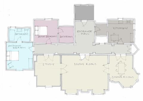
Crucial to the staging of The Father, and explicit in the screenplay, is that while it is set across three locations — Anthony’s flat of 30 years, the flat of his daughter Anne (Olivia Colman) where he stays for a time, and the residential care home in which he ends up — it all plays out in the same space, with fixed architecture. For Francis, that meant creating a high-ceilinged mansion apartment set with a long corridor (“the spine of the set”) and a warren of rooms at West London Film Studios, which could be repainted and redressed for each location — no mean feat on a five-week shoot in which only the externals and a hospital dream sequence were shot elsewhere.
An evolving space
“We started off with Anthony’s flat,” says Francis of the methodical process. “Anthony has lived in this flat for 30, 40 years, so it’s got to feel loved, eclectic, like it has all his memories in there. We know he was an engineer, it says that in the script, so that gave me the idea of a strong, masculine design. We went with a warm ochre, green and brown palette, and we dressed it like it was an old man’s collection of nice things, both older and newer. The biggest accolade was Anthony Hopkins telling me how comfortable he felt in the set, how real it felt to him.
“Then we had to revamp that into Anne’s flat, which was much softer,” adds Francis. “We decided Anne had been living there for about four years, so it was a warm mix of contemporary and period pieces, because she’s inherited some of her father’s tastes. We went for a dusty-blue colour scheme, because we wanted that to eventually become the cold, clinical blue of the care home.”
A combination of this shifting colour palette plus the alternating of everyday objects, increasingly claustrophobic framing from cinematographer Ben Smithard and crafty edits from Yorgos Lamprinos means the viewer is constantly wrong-footed, never sure when or where they are. While this was the intention, Francis had to find a way of emotionally manipulating the audience without overwhelming the narrative or the performances.
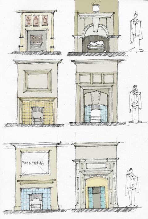
“Subtlety was key,” he says of striking this balance. “If the audience don’t notice we’ve done something, then that’s good from my point of view because my job is never to detract from the actors. If we had started changing the architecture, that would have been a problem. So we stuck to details. We hung different pictures in similar arrangements, for example. And the doors throughout the set are designed to be quite distinctive, but you wouldn’t necessarily notice them if we didn’t change the colours on the walls, change the set dressing.”
It is these morphing colours, rather than the physical objects, that Francis credits with really involving the viewer in Anthony’s experience. “The colour has to tell the story,” he says. “You know when you decorate your house and you paint it different colours, the atmosphere feels completely different. For the care home, we put a cheap brown carpet down the corridor, which completely changed the dynamic of the set. We added hospital rails along the side and hard lighting, and the corridor seemed to shorten.
“Ben’s lighting was so important,” continues Francis of his collaboration with DoP Smithard. “He and Florian spent weeks mapping all the shots very carefully. I gave them plans of layouts with furniture, and then Ben did these amazing subtle lighting changes, which helped augment these colours.”
Through its delicate balance of screenplay, performance and design, The Father captures the emotional fallout of dementia and encourages the audience to draw its own conclusions. “This is a film about memories,” says Francis. “It was my job to bring Anthony’s memories alive throughout this space.”


![The Brightest SunScreen[Courtesy HKIFF]](https://d1nslcd7m2225b.cloudfront.net/Pictures/274x183/3/5/0/1448350_thebrightestsunscreencourtesyhkiff_312678.jpg)









No comments yet