Sam Mendes drew on his own life experiences to create Empire Of Light — set in the early 1980s on the south coast of England. Screen talks to the filmmaker and key design department heads.
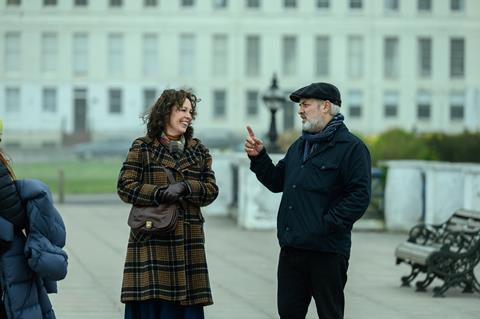
Set in 1980 and 1981, Sam Mendes’s Empire Of Light is the loosely autobiographical tale of bipolar deputy cinema manager Hilary (Olivia Colman) and her affair with Stephen (Micheal Ward), a young Black man who comes to work in her provincial cinema. It is a story that draws on the director’s love of movies and the music of the period — a time of political, racial and social turmoil — while the character of Hilary takes inspiration from the filmmaker’s own mother.
Despite having worked with production designer Dennis Gassner on his previous five films, Mendes — whose last feature 1917 made a big splash at the 2020 Oscars and Bafta Film Awards — approached No Time To Die’s Mark Tildesley to recreate the English south coast world outlined in his first solo screenplay. “It’s good to change up and keep things fresh,” says the filmmaker. “I was very struck by Mark’s work, particularly on Phantom Thread, his sense of period, the fact he’s unafraid of colour. He did the most recent Bond, which is a trial by fire. So I felt here was a kindred soul.”
Empire Of Light premiered at Telluride and is backed by Disney’s Searchlight Pictures, which began the film’s run in North America on December 9 ahead of a January UK release. It is set at a particular moment in youth culture, and Ward’s character Stephen is a fan of the UK’s multiracial 2-Tone ska music scene, reflected in his sharp casual style. However, explains Mendes, “I didn’t want to have the sense that the period was advertising itself. I always get suspicious of films and television shows in which everything is perfectly in period. Every piece of clothing is bought in 1981 and every car is 1981. If you look around you, it’s the last 10 years of clothes, fashion, cars, that you’re looking at.
“So in the early ’80s, there’s an amazing crossover between relatively contemporary period stuff at the time, whether it be goths or new romantics or a bit of post-punk. But then you’ve got the remnants of the ’70s and you’ve got people still wearing their hair long and wearing flares and wide ties, so you’ve got a lovely crossover. And that’s the same in buildings, so that was something I wanted to make sure happened in the production design.”
The director “came fully armed with fantastic ideas”, says Tildesley, whose credits include The Two Popes, 28 Days Later and the 2012 London Olympics opening ceremony. “He is like an Exocet missile in terms of what he wants. That doesn’t mean he’s not collaborative, but he absolutely gives you very strong direction.”
Initially Mendes considered filming in black and white, but decided against it after discussions with Tildesley and regular cinematographer Roger Deakins (Blade Runner 2049). “We were all too interested in the colour story of the movie, that you could contrast this bleak, monochromatic world of the British coast in the winter with warm oranges, golds and reds of the cinema interior, to try and find this language of colour in the film, which is a language of escape. Mark was brilliant at that and worked it into the sets in a subtle way.”
“There were three colour phases to the film,” notes Tildesley. “One was winter, with greens and blues and cool tones. Then we’re going into spring and the colours get a bit lighter. And we see a few more colours — even in the cars and the costumes, the colours slightly change. The final chapter is summer, and we go all Martin Parr with pinks and orange,” he says, referencing the avant-garde street photographer.
Mendes had originally located his story in Brighton. “It’s a great location, but you’ve seen it in quite a few films,” says Tildesley. “It’s also overdeveloped, so it was hard to find a backdrop that worked for the whole film.”
Then someone suggested Margate on the east Kent coast, a place once frequented by the painter JMW Turner. “I had imagined a Victorian, wrought-iron world on the south coast of England,” reveals Mendes. “Mark found something a bit edgier and more European. A bit more David Lynch than David Leland,” he adds, namechecking the UK director of 1987’s Wish You Were Here, which was set in an English seaside town in the 1950s and largely filmed along the coast in Worthing. “[In Margate] very little has been built in the last 30, 40 years. And the seafront is curved, not straight, so you can see the bay as you walk along it, as opposed to most south coast towns.”
Hero location
At the centre of Empire Of Light is the titular cinema, where Hilary and Stephen work alongside other characters played by a cast including Colin Firth, Toby Jones and Tom Brooke. Mendes had based the Empire on a cinema in Brighton that is now a casino. “In Sam’s script, it is plonked right on the seafront, opposite the sea,” explains Tildesley, “and comes from those memories of when you were a kid in the UK going on holiday and it’s raining, and mum suggests you head to the cinema, which is warm, like a womb, full of red velvet and the smell of popcorn, and is a total treat. We tried to find a cinema that had that feeling.”
“I wanted a sense of faded grandeur,” says Mendes. “These are big independent cinemas I remember of my youth. They were enormous, they had multiple screens and showed big commercial films like Raiders Of The Lost Ark and Star Wars alongside Raging Bull, Being There, Gregory’s Girl and The Elephant Man. I didn’t want it to be an impossibly high-minded arthouse cinema showing Truffaut and Kurosawa.”
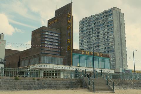
“We visited lots of different cinemas, and so many have been turned into bingo halls or churches,” says Tildesley who, on his first trip to Margate, found a former cinema complex known as Dreamland on the front. “At the far end of this curved sandy beach was this Art Deco building. Inside, it was derelict. It had been completely torn to shreds, but the bones were there.” Externally, it was almost perfect for what Mendes had in mind. “It had this amazing exterior which we had to rework, putting up our own neon signs and building a façade. And we needed a box office at the front, in the middle of the doors.”
But as Dreamland’s foyer was subterranean and did not look out on to the seafront as required, Tildesley needed to create his own. “I was looking on Google Earth and realised about 10 doors down was a building site where an amusement arcade had burnt down, so we hatched the plan to build our foyer there.”
The size of the entrance hall was as important as its positioning to Mendes. “You want the sense of scale,” says the director. “For the public, it’s a transitional space. For the people who work there, it’s home. The lobby has its own energy and its own rules. There are big dramatic scenes that take place there, so I needed it to have a presence. Sometimes it’s packed and sometimes it’s empty, and the mood changes as the weather changes.”
To illuminate the seafront, Deakins asked for a series of festoon lights. “I imagined we were going to do two or three bays, four bays maximum, to cover the shot,” laughs Tildesley. “But Roger pointed to the end of the road, about a quarter of a mile down, and said, ‘Could we have festoons from here to there?’ Which meant thousands of bulbs. But it was worth doing.” The production bequeathed them to the town when they left.
Faded glory
Mendes’s script also called for a derelict, unused top floor of the cinema building, where Hilary and Stephen discover a pigeon with a broken wing and later begin their love affair. Fortunately, Dreamland’s abandoned ballroom had been converted into a Chinese restaurant, and Mendes retooled the script to take advantage of the space. Tildesley added chandeliers, a dancefloor, mirrors, pillars and a grand piano to give “a sense of former glory”, as well as covering each window with yellow film. The corridor leading to the ballroom still had some of its original features and can be seen in the movie, along with the old foyer whose concession stand Tildesley replicated in his design.
Dreamland’s main auditorium had been turned into a pea-green bingo hall in the 1970s and required total restoration to transform it into the Empire’s 750-seat number-one screen, which plays host to the south coast premiere of Chariots Of Fire.
“We built the stage, the curtains, the walls,” says Tildesley, who found all the old cinema seats in the abandoned upper circle and had them reupholstered, adding a few more “to give the scale Sam was after”.
“On one level, you want people to understand the craft and the act of love it was to recreate this cinema,” says Mendes. “At the same time, you don’t want people to think it’s a set; you want to believe it exists.”
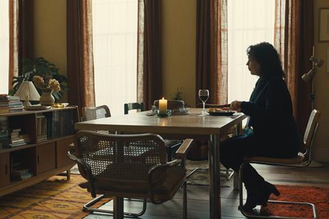
The remainder of the sets were constructed in an old aircraft hangar at nearby Manston airport. These included the Empire’s projection booth, Stephen’s flat and the hospital set that was a former baggage area. Then there was Hilary’s seafront flat, the exterior of which was in Margate. “We copied the framework but made it 25% bigger,” says Tildesley.
The interior was trickier because it needed to show the progression of Hilary’s mental state as her illness kicked in. “We tried a couple of times to mess the place up and it just looked like someone had burgled the flat.” It was Mendes who provided the key. “He said his mum would repaint things when she wasn’t happy and would paint the chest of drawers a different colour. So we decided to repaint the set a weird purple.”
“Hilary’s flat is not my childhood flat,” says Mendes. “What is a direct reflection of my mother’s story is Hilary’s journey into mental illness, as I experienced it; the various stages of bipolar, as she comes off the meds and descends into the darkness. That journey was reflected in her environment. Things that were ordered became disordered — furniture, lighting, music playing loud, alcohol appearing, cigarettes appearing and, at the height of the manic episode, total alteration of the environment. Painting the walls, writing on the walls. That was very specific from my memory, the purple and dark green she paints, the things written on the walls, what happens to the books, the mess, the untended food, stuff thrown around the place. Mark understood that brilliantly.”
Then there were the milk bottles. “The last thing Sam said was, ‘I remember my mum used to turn milk bottles upside down,’” says Tildesley. “So in the film there are about a dozen on various surfaces — which is slightly strange but wonderful.”
Street style
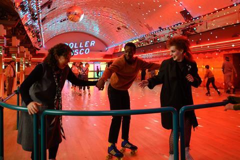
Costume designer Alexandra Byrne (a 2008 Oscar winner for Elizabeth: The Golden Age), who had worked with Tildesley on Phantom Thread, began by tracking down the photo archive of Brighton’s The Argus newspaper to see how people dressed back then in a south-coast town. “There’s a man who has the entire, non-digitised archive in a lock-up,” says Byrne. “We went through lots of images. It’s day-to-day life. And while it was quite tribal, it was really nuanced. There wasn’t social media to define the code. People didn’t have a lot of money. You couldn’t go and buy the kit. You had to do your version or nod towards it.”
Finding the right shade for the Empire staff uniforms took much thought. “I’ve never seen a good-looking usher’s uniform,” says Mendes. “The best they can be is black trousers and a coloured waistcoat. I wanted that either to be cerise or plum. I wanted two purple people in a blue room when they first go into the abandoned ballroom.”
“It was about working with Mark, with Sam, talking to Roger, finding the right colour,” says Byrne. “Black is the easy option, but I knew that was too harsh and would be too graphic, and I didn’t want to go brown, so this purple emerged, and the shirts are slightly different shades of red.” Byrne had the polyester uniforms made in a factory for that “factory finish” and they came in standard sizes, so they did not fit the actors perfectly.
“You had to have a belt, or it was too tight, or the trousers were too long. It’s incredibly subtle but adds up to giving people a reality. There was as much work in the uniforms as in the non-uniform clothes.”
While a large number were manufactured, many garments were sourced from Oxfam charity shops and other second-hand dealers, with characters’ exact costumes often chosen on the day of filming. “Once they’d rehearsed, we would narrow it down to the final look,” says Byrne. “The danger with this film is the story is so intimate and so intense you didn’t want to wave great big flags in terms of what was happening or where Hilary was. I worked with Naomi [Donne], the hair and make-up supervisor. She used black make-up on Hilary’s eyes as the indicator of her manic-ness. And I didn’t always want to be in synch with that.”
One moment where hair, make-up and costume were in synch is when Hilary embarrasses herself on stage at the Chariots Of Fire premiere, wearing a cobalt blue dress based on a vintage design in black from the Frank Usher label that “had the right potential for the vulnerability”, says Byrne. “I brought to Sam the idea of the zip being open at the back, because that is the nightmare of people who live alone, which seemed in tune with Hilary’s manic state.”
“I wanted that feeling she had overstepped,” says Mendes of the film’s pivotal scene. “That dress was a bit too flamboyant, and she couldn’t quite pull it off. Her hair’s unwashed, she’s got too much make-up, you feel she’s out of control, and there’s great danger of humiliation. At the same time, it couldn’t be too comic. It had to be absurd, but somehow tragic.”



![The Brightest SunScreen[Courtesy HKIFF]](https://d1nslcd7m2225b.cloudfront.net/Pictures/274x183/3/5/0/1448350_thebrightestsunscreencourtesyhkiff_312678.jpg)








No comments yet